MasterCard Serbia asked ladies to share FB photos of, among other things, their credit card

Credit card companies should know all about phishing, right? McCann should know all about marketing, right? Combine the two in Serbia and you will get a marketing campaign that just went viral, although for the wrong reasons.

Mastercard Serbia organised a prize contest “Always with you” that asks female customers to share contents of their purse on Facebook. If you read the text carefully, it is not required to photo your card. However, the example photo clearly shows the credit card details of a fictive customer:

Lured by prizes, many customers posted photos of their private stuff. And some copied Mastercard promo — their credit card, with full details, is visible in the photo:

This is the first phishing campaign that I know that was organised by credit company itself!

The funny thing that is that nobody in Mastercard, McCann agency or legal team noticed the problem. There is a lengthy legal document explaining the conditions of the prize contest:

That document is signed by Mastercard Europe SA and McCann Ltd Belgrade, so it seems it has passed multiple levels of corporate approval. And Mastercard didn’t seem to notice the problem until six days later when a serbian security blogger wrote about it.

In my modest opinion, the lesson of this story is to be careful how you hire. I am biased because I run an employee assessment company, but smiling people with lovely résumés can still be bozos. And when you have incompetent people in the company, it doesn’t matter what formal company procedures you have in place.


P.S. As user edent from HN noticed, photo sharing of credit cards is nothing uncommon for Twitter: https://twitter.com/needadebitcard

P.P.S. As of today (May 18), entire “Always with you” campaign is deleted from Facebook.


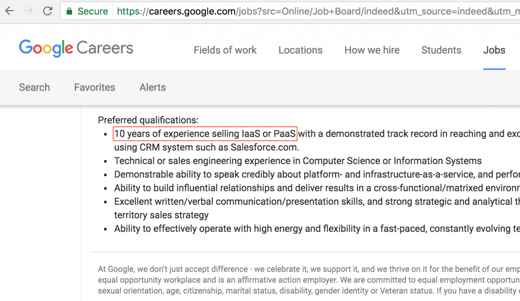
10 years of experience selling IaaS or PaaS

Today, a friend sent me a funny Google job posting. Here is the highlight:

10 years of sales experience? Amazon EC2 (IaaS) only came out of beta in Oct 2008, Google App Engine (PaaS) only had a limited release in Apr 2008. Now is Feb 2017, so even if you got started selling EC2 or App Engine from the very first day, you would only have 8 years of experience.

I know you are Google, but it is a bit too high of a bar. You still haven’t invented the time machine.


Car Sharing and the Death of Parking

Article was originally created for Vice Motherboard, which holds distribution rights till Sep 2018.
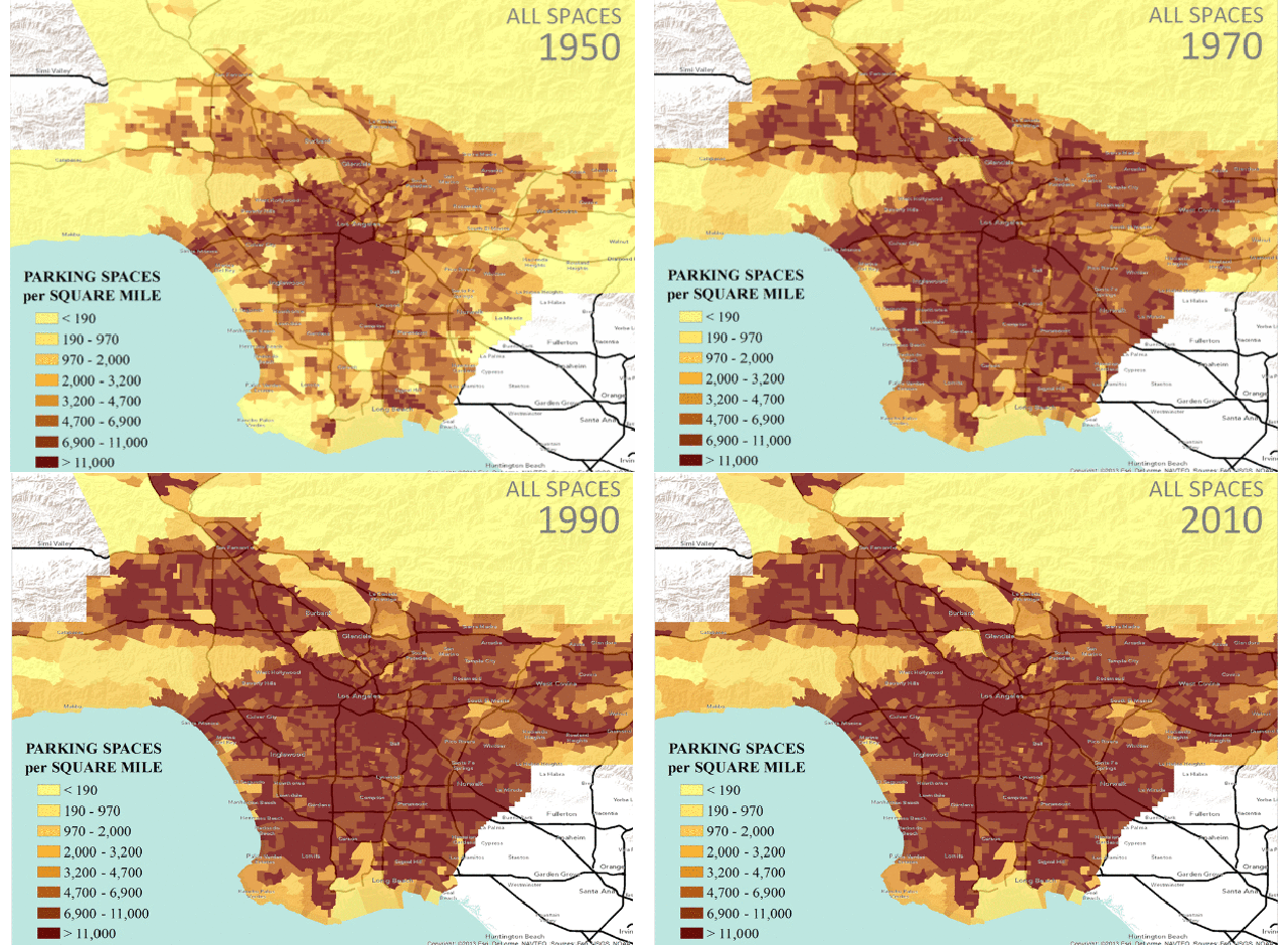
all_20spaces-0
Rise of parking spaces in Los Angeles

Sometimes the future arrives humbly in our everyday life, until one day we realize its implications. Carsharing is like that—I was ignoring it until I noticed car2go popping around Berlin:
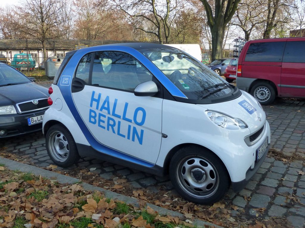
berlin-car2go

I had tried ZipCar (USA) and Co-wheels (UK) before, but this was different. ZipCars and Co-wheels cars needed to be booked for a few hours and then returned to the same spot. Car2go allowed me to book a car by the minute and leave the car anywhere in the city zone. When I reach my destination, I can park the car anywhere, sometimes using smart parking, to the enormous joy of the parking-seeking SUV owner behind me. When going somewhere in the city, driving back and forth takes less than an hour, so for the rest of the evening, that car2go can be used by other users.

One alternative to carsharing is ridesharing (Uber, Lyft, or similar), but ridesharing is more expensive (you need to pay for a driver) and I will argue that it is just an intermediate step until we have self-driving cars.

Both carsharing and ridesharing solve the biggest problems of cars in the city: utilization. The average private car spends 95 percent of its time parked somewhere, where it waits faithfully for you to finish with your work, shopping, or a great social time that will make you too intoxicated to operate it.

A death of parking

In comparison, a shared car with 50 percent usage has 10 times better utilization and needs parking only half the time. But, that doesn’t mean that the ideal carsharing city will need half the parking spaces. Surprisingly, carsharing would reduce the number of parking spaces a city needs by more than 10 times.

Let’s calculate for total carsharing (all private cars replaced with shared cars) with 10x better utilization:

Private carShared car (10x)
Used5%10 x 5%
= 50%
Parked95%50%
Number of cars in the cityNN / 10
Parking places neededN x 95%(N / 10) x 50%
= N x 5%
Parking reduction(N x 95%) / (N x 5%)
= 19x

Ideally, if shared cars are used 10x more, we need 10x fewer of them to power the city. But since they also spend less time parked, we need 19x fewer parking spaces!

But there is a miscalculation in the above math.

It is questionable whether 50 percent carsharing utilization can be achieved because of rush hours and the suburban commute.

Rush hours mean that most people want to use cars during peak times. Let’s suppose that all people need cars in a three hour peak and that the average non-rush commute lasts for 30 minutes (I will explain later why I’m using a non-rush commute). Then we can only have 6x fewer shared cars to replace private cars, not 10x.

But an even larger problem is the suburban commute—from suburbia to the city in the morning, and the other way round in the afternoon. The first commuter in the morning leaves a shared car in the wrong place—in the city. This is not such a big problem in Berlin, because people live and work in all neighborhoods of the city. But it is a big problem for American cities because of their typical suburban sprawl. Every morning, the number of shared cars in your cul-de-sac should match the number of morning commuters. Maybe that is one reason ZipCar in the US allows one-way trips only with designated cars and only in Boston, LA, and Denver.

Self-driving cars come to the rescue. They could drive you to the city and then come back to pick up the next commuter. This halves the efficiency, but is still better than leaving cars idly parked. As the original 10x utilization was probably too optimistic, let’s recalculate using 6x and 3x:

Shared car (6x)Shared car (3x)Shared self-driving car (3x)
Used6 x 5%
= 30%
3 x 5%
= 15%
3 x 5%
= 15% x 2 = 30%
Parked70%85%70%
Number of cars in the cityN / 6N / 3N / 3
Parking places needed(N / 6) x 70%
= N x 11.7%
(N / 3) x 85%
= N x 28.3%
(N / 3) x 70%
= N x 23.3%
Parking reduction(N x 95%) / (N x 11.7%)
= 8.1x
(N x 95%) / (N x 28.3%)
= 3.4x
(N x 95%) / (N x 23.3%)
= 4.07x

If everybody commutes from suburbia to the city and utilization is only 3x, the city gets to have 3.4x fewer parking lots, not bad! With self-driving cars, cities can reclaim even more street space. When they are not needed, an army of self-driving cars can drive themselves to multilevel garages or off-city parking.

It gets better. If you have ever bought a private car, you probably did a largest common denominator calculation—what is the longest trip you will need the car for? Because there are two times in a year when you go camping, you commute to your work in a large sedan or SUV. Alone. When picking a shared car, you use the lowest common denominator—the smallest car that will get you to your destination. And two smart cars fit in a single parking space.

This is a eureka moment for carsharing and self-driving cars. Most people I talk with think the cities of the future will be similar to today, except that you will own an electric self-driving car. In my modest opinion, that is similar to people of the 19th century imagining faster horses.

But wait, there is more

The annihilation of parking lots is just one of the benefits of carsharing:

  • Currently, if you use a private car to travel to a destination, you also need to use it to return from a destination. Carsharing cooperates with other modes of transport. Go somewhere with a foldable bicycle, and if it starts to rain, no problem. Book the closest shared car and put the bicycle in the trunk. Go to a bar with a shared car, get tipsy, and book a Lyft ride back home.
  • Fewer parked cars means you spend less time looking for parking. Research shows that on average, 30 percent of the cars in congested downtown traffic are cruising for parking.
  • You need to walk from your location to the location where you parked a private car. In an ideal carsharing city, you just walk out and take the first shared car available outside.
  • Because people are driving smaller shared cars, there is less pollution.
  • If you need a van, a truck, or a limousine, you just find and book one using a smartphone.
  • Insurance and servicing is handled by the carsharing company, not you. Because they have a huge fleet, they get volume pricing.
  • When your car breaks, you don’t need a replacement car. Every carshare you see is your “replacement” car.
  • With less need for parking space, through streets can ditch side parking and add two extra traffic lanes.

Not everything about carsharing is perfect. Sometimes the shared car I got wasn’t quite clean—somebody had transported a dog on a passenger seat. But, when I think about it, I didn’t clean my previous private car for months and sometimes it looked like I was transporting pigs with diarrhea, so maybe I shouldn’t complain.

How does the future look now?

Berlin is quite competitive, so we get a small glimpse of the future. Car2go, owned by Daimler AG, originally offered only smart cars. Car2go’s biggest competitor is DriveNow, owned by BMW and Sixt, which offers Minis and BMWs, like this electric i3:
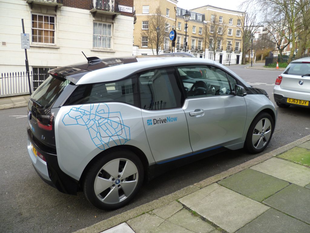
bmw_drive_now_2Car2go decided to pimp up its rides, so now you can book a Merc:

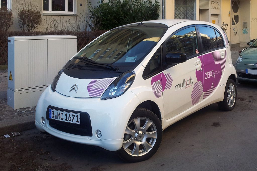
webimage-22d13769-4db3-401c-b0311ca8e315c6f8Citroen also decided to join the party. The company offers a fleet of mostly electric C-Zeros with Multicity:
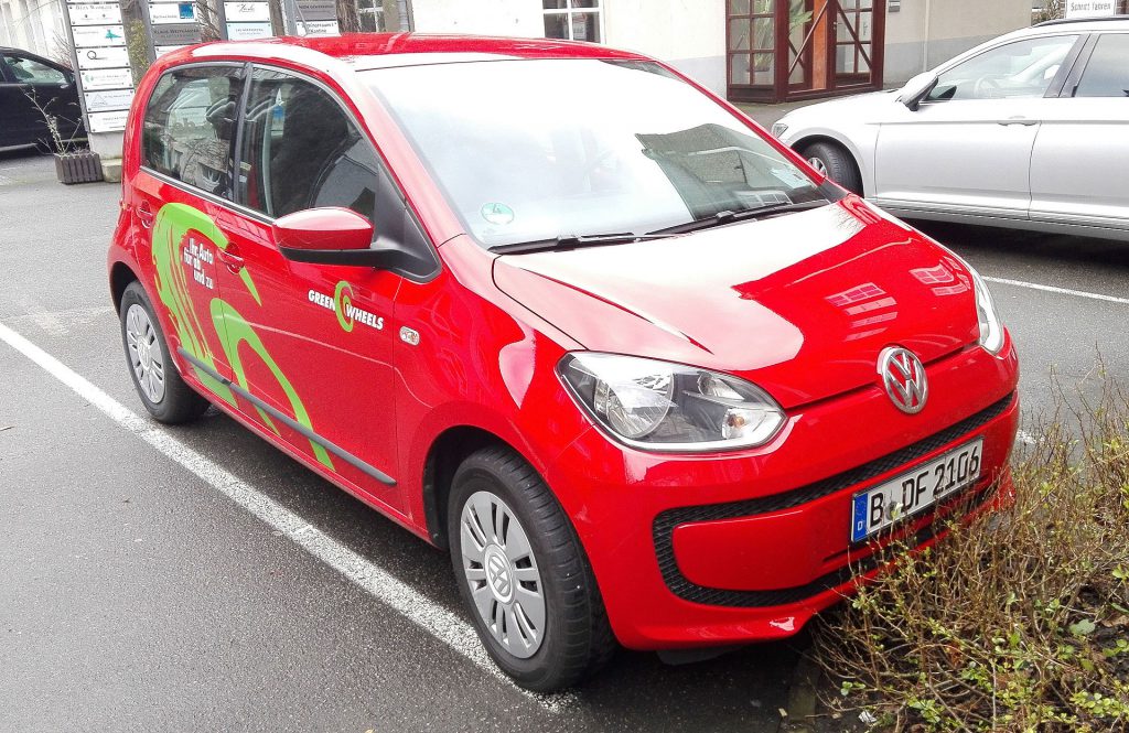
multicity_citroen_c-zero_berlin_flVolkswagen got angry that Mercedes and BMW were eating all the cake, so it purchased a 60 percent stake of Greenwheels:
greenwheels_deWhile Sixt is partnering with BMW, Hertz has its own Hertz On Demand, although it is obvious from its website that Hertz is still in rent-a-car mindset and doesn’t understand how the new thing works.

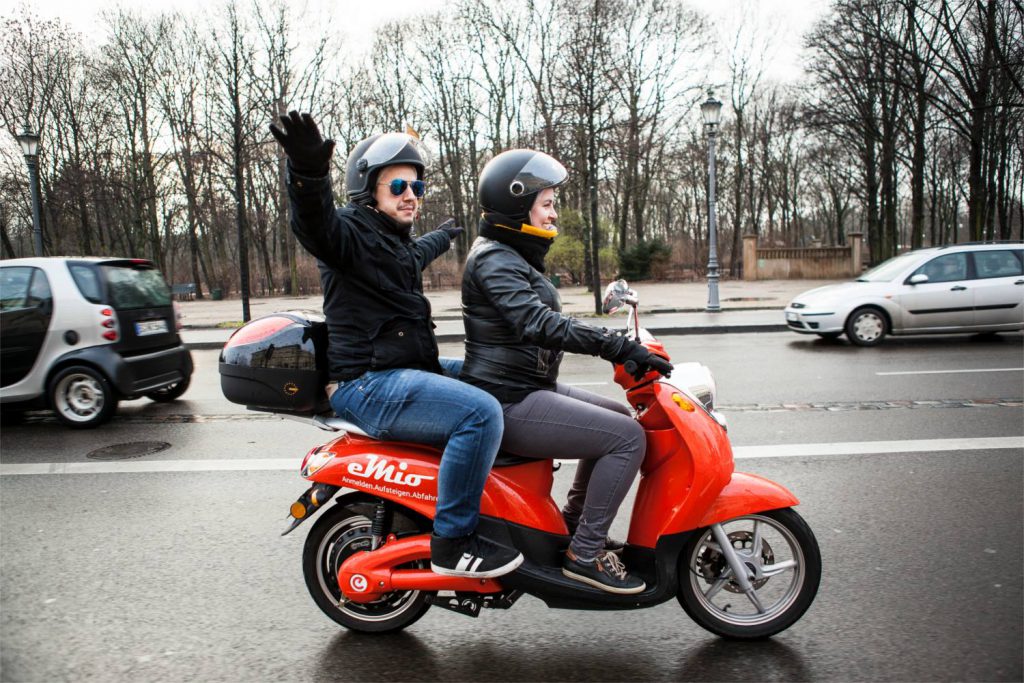
But why stop at cars? Other vehicles have the same problem; you only use them 5 percent of the time. eMio offers the same sharing concept for electric scooters:
12819449_1667878436800179_1815803174772161990_oDon’t laugh at the idea of shared scooters. This is a cultural thing—while in the US, the ideal transportation vehicle is a sedan and in Europe a compact car, two billion people in Asia consider scooters a family transport solution. Look at this nice family in Vietnam:

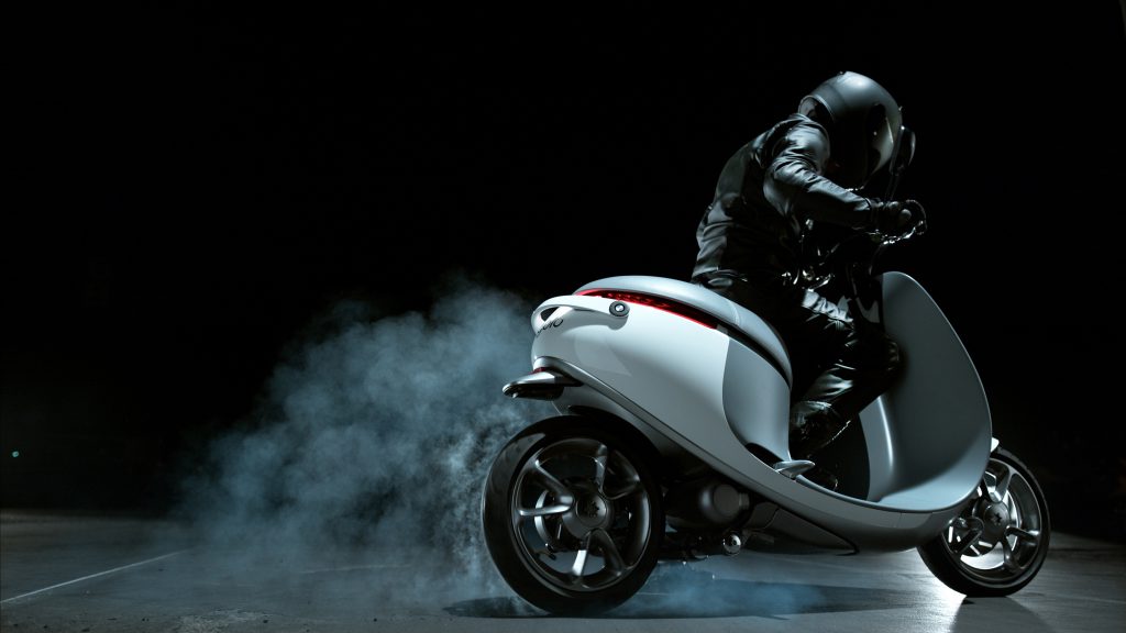
26220518712_cb51aeaecd_zAnd eMio is not the only one. Just last month, Coup launched a fleet of 200 beautifully designed, Gogoro electric shared scooters to Berlin:
gogoro-burnoutBoth Coup and eMio have an unusual charging solution: their teams go around the city and swap empty batteries for full ones.

Other carsharing companies have “socially automated” refueling. For example, in car2go you don’t ever have to refuel, but they give you 10 free minutes if you fill up a car with less than a quarter of a tank of gas.

Prices are already reasonable. In my experience, car2go smart is half the price of Uber in Berlin (which is not the real Uber, to be honest). But it can go lower with better utilization and economies of scale.

Finally, tourists can rent a NextBike bicycle from 1€ per 30 min.

As you can see, the situation is quite complicated here, and I know what some entrepreneurial readers are thinking. But hold your breath, as there is already an app that displays all of the above on the same map:
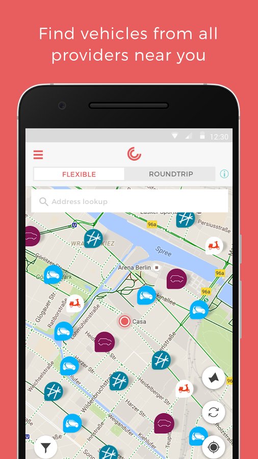
carjump

Death of traffic jams (and birth of queues)

More radical changes will happen when shared cars become a majority in the city.

Total carsharing can eliminate the traffic jams of rush hour—but that doesn’t mean you
won’t have to wait.

Why does a traffic jam happen, anyway? All people jump into their private cars at once and decide to drive along a similar route. Main routes have limited throughput, so you end up queueing on junctions and on the highway. The queue just makes things worse, as it lowers car throughput. It is an expensive system in which you line up in a running car, waiting for your turn. In total carsharing, that can’t happen. Since there are 3x or 6x fewer cars available, there is no way that everybody can just jump in a car and go. Now you don’t wait on a highway, you wait for your turn to get a shared car. I would argue argue that this is better because:

  • You are going to wait in your home or office (for a car to become available), not on the highway.
  • There is less chance of some route “jamming” and reducing car throughput.

But waiting for shared cars opens two completely new scenarios:

  1. “Shared” carsharing. Imagine that you open a carsharing app of the future and request a car. The app puts you in a waiting queue and says that the estimated waiting time for the next car is 30 minutes. But someone from the same street is going to the same part of town. The app offers to cut your waiting time to 15 minutes if you both share the same car. Since you don’t know the person, the app offers to increase security by enabling a video camera inside the car (it is there anyway, to check whether you left the car clean). You accept the pooled ride, but decline the camera option, as the other person’s profile is rated 4.5 stars. Your car is available in 15 minutes.
  2. “Premium” shared cars. Let’s say you are in a hurry and don’t want to use a carsharing company that tries to maximize car usage. You use a more expensive carsharing company that promises to have a car available in five minutes or the cost of ride is on them. You pay a premium to get somewhere faster. It’s a nice system, although I guess in some posh downtowns everybody will try to use the premium shared cars, in which case you are back to square one. Then you need a “super-premium” car share. Another option is existing car sharing companies adding surge pricing, but Uber showed that paying 4x more for basically the same service didn’t go well with the customers.

Rebirth of the parking space

If all that space becomes available, cities can reclaim it for public use. This is especially true in Europe, where cities were never designed for cars—to make room for them, something had to be given away. Year by year, streets have been made narrower by side parking, parks have been converted to parking, and new buildings have been constructed with large parking lots next to them. If the majority of the transportation burden falls to shared cars, buildings will just need a “valet” parking area in the front. The valet will not be a real person—but your smartphone.

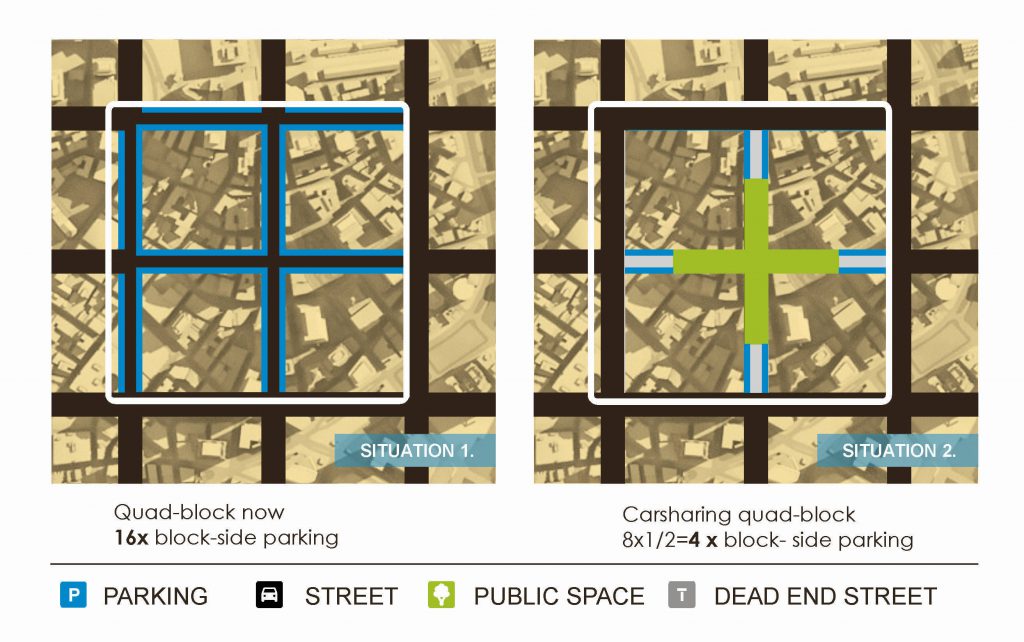
That could dramatically change suburban landscapes, where every business has it own large parking area. But even the dense city grid can be changed. For example, although Barcelona is known as a well-planned city, most streets today are taken by cars. People got excited a few weeks ago when a plan for “superblocks” was announced. The idea is to designate one-third of the streets as through roads, and two-thirds as pedestrian-friendly zones. The problem is that the second phase of the plan calls for elimination of parking in the pedestrian-friendly zone, by building off-street garages for every superblock. That is an enormous capital project for the city. With carsharing, the solution becomes easier:

  • Make every second street a through street. Eliminate side parking in through streets to add two additional lanes of throughput.
  • Make other streets half dead-end streets (used for parking of car shares), half pedestrian-only zones.

See the illustration below:
quad-block-final

This solution builds on the existing infrastructure (no new garages are needed), and you get a mini city square in place of every fourth intersection. Side parking places are reduced 4x, which is achievable with carsharing. The longest walking distance to an available car is one block.

Think what all that change would mean for Los Angeles, for example. It currently has 200 square miles covered with parking lots, 1.4x more than the total land taken up by streets and freeways.

All that transformation would be powered by the simple idea:

The purpose of cars is to be driven, not parked.

The heroes of the future

Some people had seen the future long time ago.

Zipcar, Flexcar, and City Car Club were all started in 2000. But they missed the convenience of a smartphone.

In 2007, Steve Jobs announced the iPhone and, a few years later, ridesharing companies started popping up in San Francisco: Uber in 2009, Sidecar in 2011, and Lyft in 2012.

In 2010, car2go went public in Austin, Texas.

All those services were convenient and cheap, and big companies started paying attention.

In 2014, Sergey Brin said this of Google’s self-driving car: “So with self-driving cars, you don’t really need much in the way of parking, because you don’t need one car per person. They just come and get you when you need them.”

In 2016, Elon Musk unveiled his master plan, which states: “You will also be able to add your car to the Tesla shared fleet just by tapping a button on the Tesla phone app and have it generate income for you while you’re at work or on vacation.”

In 2015, even GM said: “We’ve come to the conclusion that our industry within the context of today’s traditional vehicles and today’s traditional business model is not sustainable in its current form.”

Brave words from an old school car maker! I would also consider innovative people at GM, Daimler, BMW, Ford, and VW to be heroes, although they mask really well under the grey suits.

But every story of heroes also has a story of…

The villains

Change management 101: When there is a big change, no matter how good, there is going to be someone opposing it. In this case, it seems that one of the villains are the people we elected to work in our interest.

The private car is not a fair competitor. Parking is subsidized by both the politicians and the average people. People want “free” parking, but do you really think that 16.8 m2 of valuable land in the city is “free”? It is not just taxpayers’ money. When you go to a McDonald’s, a parking fee is hidden in the burger price because the owner needed to purchase land for a parking lot. When you purchase a condo, the price is higher because the building developer needed to build underground parking.

The book The High Cost of Free Parking estimates that the total cost of “free” parking in the U.S. is 1-4% of the GNP. (I also highly recommend that you listen to the Parking is Hell episode of the Freakonomics podcast.)  The economic price of monthly parking in big cities goes from $438 in Boston, to $719 in Rome, to a staggering $1084 in London.

What puzzles economists is simple math to politicians. Giving affordable parking to people gets them votes. My hometown of Zagreb has some great populists in power. As a city center resident, you can leave your piece of metal next to the parliament for the price of $15. Per month. For years I complained about the price of parking, but then I realized that maybe I should shut up.

If the price of parking were subject to market forces, math would be simple. Shared cars would spend less time parked and you would share the price of parking with other carsharing users. With private cars, it would be your sole responsibility to pay $500 per month for parking.

But a mayor who introduces an economic price of parking would soon be impeached. So maybe the real villain of this story is not the politician, but you, dear voter?

Conclusion

It seems that the future of urban transport is electric, self-driving shared cars. But that electric future requires new cars with great batteries, while self-driving cars are five years out. Both are going to be more expensive.

However, carsharing is already everywhere. There are rideshares like Uber and Lyft. You can convert your existing private car to a shared car with an electronics kit, such as the $99 Getaround Connect. With new legislation in the cities, which promotes the sharing of cars and doesn’t subsidize parking, we can have more liveable cities and better urban transport now, without large capital investments.

But for that, we need a change in mentality. If you agree with that, spread the word.


UPDATE: check discussions on Hacker News and Reddit.

Why App Stores Need Progressive Pricing

app-store-header

In this ever-changing world, one thing stays stubbornly the same: app store pricing.

The mother of all app stores, Apple App Store, came in July 2008 with a flat commission: 70 percent to the developer, 30 percent to Apple. Android Market (now Google Play) was introduced two months later, with the same cut: 70/30. Windows Store was four years late to the party, so Microsoft decided to set bait. Developers started with a 70/30 cut, but then were upgraded to an 80/20 cut after they had reached $25,000 in sales.

In eight years, Apple experimented with dubious design choices, the Microsoft board decided that Ballmer should stop dancing, but app store pricing didn’t change. Yes, Apple introduced an 85/15 cut, but only for subscriptions, and only after the first year. On the other side, Microsoft ditched its initial discount in 2015 and went with the standard 70/30. Which begs the question:

Is 70/30 some magic ratio or just an arbitrary convention?

Let’s examine that. From a developer’s perspective, the app stores provide the following benefits:

  • Payment processing. For developers, it eliminates the pain of connecting to credit card systems and merchant accounts. For users, it reduces payment friction, making them buy more.
  • Hosting. App stores do reliable hosting, even when there is a surge of traffic. No more updating servers, or waking up in the night because of a hacker intrusion or a DDoS attack.
  • Quality review. Before publishing, apps need to pass an acceptance review. Developers often hate this procedure, but a marketplace without viruses or broken apps makes a user experience better. Satisfied users buy more.
  • Marketing. It is hard to reach users. App stores promise that if you have a high-quality app, it will go up in the rankings and maybe end up in the featured section.
  • Platform access. Apple, Google, and Microsoft invested hugely in creating a platform and devices on which you can run your apps. Maybe a part of their 30 percent cut is a fee to access their platforms?

Reasons to use app stores are quite compelling, and all platforms are moving in that direction.

But, the value of listed benefits changes significantly with the perceived user value of the app. This dynamic is not intuitive, so let’s use two imaginary developers as an example:

FlappyElephant app is a simple, casual game, made by one developer in his spare time. It costs $1.AcmeShop app is a complex editing tool for photographers and illustrators. Made by a team of 200 people, it costs $100.

These developers’ views on the above app store benefits are quite different:

Payment processing
FlappyElephant: Great, I get charged only 30 cents on the dollar! Other payment collectors charge up to 75 cents per transaction. And there is no way a customer would otherwise take out a credit card for a $1 indie game.AcmeShop: $30 per transaction!? Our Stripe-powered webshop costs us $3.2 per transaction (2.9% + 30¢), 9.4x less!
Hosting
FlappyElephant: After I deploy, I don’t have to worry about it. It can scale and customers will get the update automatically.AcmeShop: We already have our own servers; the app store is just one more place where we need to deploy.
Quality review
FlappyElephant: Annoying, but at least they let me know it breaks on tablets.AcmeShop: Every release is delayed for two days. On iOS, ratings are reseted after every release.
Marketing
FlappyElephant: I can’t believe so many people are finding my small app. Otherwise I would be roasted; AdWords is $1 per click and nobody searches Google for “flappy elephant”.AcmeShop: People buy our $100 app because they have known us for 10 years, not because they noticed us while scrolling a list with 50 other apps.
Platform access
FlappyElephant: If there were no smartphones, there would be no FlappyElephant!AcmeShop: If there were no tools like ours, creative professionals wouldn’t use the platform!

Two app developers, two very different stories. While FlappyElephant’s developers would pay even 50 percent, AcmeShop’s developers consider everything above 10 percent to be a ripoff.

There is a way to satisfy both parties: progressive pricing. The commission should fall as the price of the app increases, which can be implemented in many ways.

For example, this funky-looking formula:

Commission = 22 / (9 x Price + 90) + 7 / 90

Has a nice property of commissions for $1, $10 and $100 being round numbers:

PriceCommission
$130.00%
$228.15%
$524.07%
$1020.00%
$2015.93%
$5011.85%
$10010.00%
$2008.94%

Price can be either actual transaction price, or, arguably more fair, cumulative user spend per app. In the case of latter, after user purchases 10 times a $10 monthly subscription, cumulative user spend is $100 and the developer is given a 10% commission. Again, this is just one of progressive pricing options.

I think that makes perfect sense. I purchase many $1 apps impulsively, thanks to the app stores. But I never purchase anything above $20 without going to the Internet and researching all the alternative options. I buy an expensive app because I trust the developer, and then the app store just makes it more expensive. Not just 30 percent. App stores make it 42 percent more expensive (30/70=42.8%).

Of course, big developers like AcmeShop are not stupid. They have found a way to have their cake and eat it too. The solution is simple:

  1. Make your apps free.
  2. In order to use the app, users need a separate “cloud” account.
  3. The free account doesn’t offer much.
  4. The free app unlocks content or features that can be purchased in the “cloud.”

One by one, big developers have started implementing exactly that strategy.

For example, the Amazon Kindle iOS app doesn’t allow book purchasing:

ipad_kindle_faq_cropped

Kindle’s Android app is even more blunt; it circumvents Play Store with a built-in browser (!):

android_kindle

Microsoft Office mobile is free for devices smaller than 10.1 inches, but larger devices need a separate Office 365 subscription:

collaborate_using_microsoft_word_for_ipad_app_18

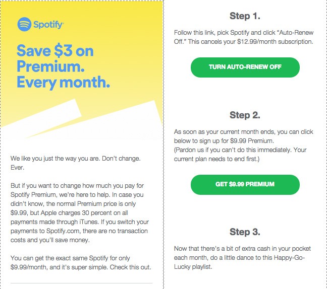
Spotify has a slightly different system. It offers in-app purchases, but they are more expensive than purchasing a subscription on their website. Spotify even sends an email to users warning that they made a stupid decision:

spotify-premium

Practically every music subscription service has been circumventing app store payments since 2011.

So, congratulations, dear app store product manager. You just shot yourself in the foot. You were greedy for 30 percent and now you are getting zero percent. And users of your app store are annoyed that purchasing something requires switching to a browser. But what can you do? If you kick Kindle, Office, and Spotify off your app store, then nobody will care about your platform. So maybe big developers are right—maybe you should pay them to publish great software on your store? Like when Microsoft was paying selected developers up to $100,000 to port their apps to Windows Phone.

Mobile app stores have a problem with big developers avoiding payment systems, but desktop app stores have an even bigger problem: they are avoided altogether.

This year, the co-founder of Epic Games wrote a long rant about UWP and Windows 10 Store, asking for Microsoft’s guarantee (among other things) that:

“…users, developers, and publishers will always be free to engage in direct commerce with each other, without Microsoft forcing everyone into its formative in-app commerce monopoly and taking a 30% cut.”

But the Windows 10 Store is good compared to the Mac App Store, which is a joke. It is only useful for downloading Apple apps—in which case Apple pays a commission to itself. Even top-grossing featured apps are leaving, and switching to manual installation. Compare that experience to that of a mobile app store install:

MacOS manual installiOS
  1. Google for a developer webpage.
  2. Find and download a Mac version.
  3. Mount the downloaded DMG (double-click).
  4. Open the mounted drive. It contains two files: an app and a shortcut to the application folder.
  5. If you clicked the app, you just made a mistake! That is just going to run the app from the mounted drive.
  6. Instead, drag and drop the app to the application folder (there is usually an arrow so you don’t get confused about what to drag where).
  7. Eject the mounted drive (using the right-click menu).
  8. Delete the DMG.
  9. When starting the app for the first time, authorize it using a security dialog.
  1. Find an app in the app store.
  2. Tap the “Get” button.

Mounting drives? Dragging and dropping to a system folder? What is this, an 80s Mac with a floppy drive?!

And, in case a Mac app doesn’t have an automatic updater, for every upgrade you have to repeat the exact same procedure.

On Windows, manual installation is a few steps simpler, and you often get a nice malware as a reward for your effort. Like the PCs of my extended family. One of them has so much malware it would be the envy of the Kaspersky Lab researchers.

Why are Mac and Windows still in the Stone Age of app distribution?

Back to the original question. I argue that a 70/30 cut is an arbitrary ratio trying to be one-size-fits-all. It fails at that because the value proposition is completely different for developers of low-price versus high-price products. And app stores fail to profit on high-price apps, because that high price is listed somewhere else.

So, we are now in a triple loss-loss-loss situation:

  • Users have a bad experience because purchasing or installing an app is convoluted.
  • Developers have to create workarounds that create user friction.
  • App store owners make zero money on high-price products.

And it is all because of tech politics.

I will end with that conclusion, as I need to go and mount/unmount some drives.


UPDATE: Check the discussion on Reddit.

Web bloat solution: PXT Protocol

After many months in the making, today we are happy to announce v1 of PXT Protocol (MIT license). This is a big thing for our small team, as we aim to provide an alternative to HTTP/HTML.
Before I dive into technical details of our unconventional approach, I must explain the rationale. Bear with me.

Web bloat

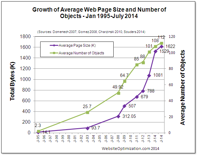
Today’s web is in a deep obesity crisis. Bloggers like Maciej, Ronan, and Tammy have been writing about it, and this chart summarizes it all:

growth-average-web-page2014

Notice the exponential growth. As of July 2016, the average web page is 2468 kB in size and requires 143 requests.

But computers and bandwidth are also getting exponentially faster, so what’s the problem?

Web bloat creates four “S” problems:

  1. Size. A few years ago, a 200MB/month phone data plan was enough. Today my 2GB plan disappears faster than Vaporeon pokemon.
  2. Speed. The web can be 10x faster. Especially over mobile networks, as phone screens need to show fewer elements.
  3. Security. The modern browser is actually an OS that needs to support multiple versions of HTML, CSS, HTML, SVG, 8+ image formats, 9+ video formats, 8+ audio formats, and often adds a crappy plugin system just for fun. That means the browser you are looking at right now has more holes than a pasta strainer. And some of them would allow me root access to your system right now. I just need to offer enough bitcoins on a marketplace for zero-day exploits.
  4. Support. All that bloat needs to be implemented and maintained by people. Front-end has become so complicated that now designers who can also code are called unicorns.

One can say “Problems, schmoblems! We had problems like this in the past, and we lived with them. The average web page will continue to grow.”

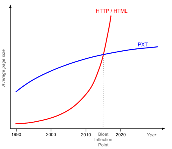
No, it will not. Because there is a magic limit—let’s call it the bloat inflection point:

Bloat-inflection-point

For pages that are small and non-bloated (most pre-2010 pages), PXT only solves security and support problems. But today’s average web page will also gain big size and speed improvements. The Internet passed the bloat inflection point early this year, and nobody noticed.

PXT solves these problems by focusing on the core: the presentation. The majority of bloat pushed to client browsers has only one purpose—to render the page. Even JavaScript is mostly used to manipulate DOM. Images alone comprise 62% of a page’s total weight. Often images are not resized or optimized.

Responsive webs just make it worse. The fashion now is to have one sentence per viewport and then a gigantic background image behind it.

Developers have gotten lazier and lazier over the years. At the same time, compression technologies got better, both lossless and lossy. So we got an idea…

What if a client-specific page was rendered on a server, and then
streamed
to a “dumb browser” using the most efficient compression?

Like all great ideas, this sounds quite dumb. I mean, sending text as compressed images?! But I did a quick test…

Demo time

Let me show you a simple non-PXT demo; you can follow it without installing any software.

The procedure is simple:

  1. Find a typical bloated web page.
  2. Measure total page size and # of requests. I used the Pingdom speed test.
  3. Take a full page screenshot. I used the Full page screen capture chrome extension.
  4. Put into table and calculate the bloat score.

Bloat score (BS for short) is defined as:

BS = TotalPageSize / ImageSize

We can derive a nice rule from the bloat score:

You know your web is crap if the full image representation of the
page is smaller
than the actual page (BS>1).

I expected some screenshots to beat full page loads, but I was wrong. Screenshots won in every case. See for yourself in the table below: Image columns contain links to comparison images.

Full
PNG

(1366 x ?)
Full
TinyPNG
(1366 x ?)
Viewport
TinyPNG

(1366 x 768)
PageSize (kB)# of req.Image (kB)BSImage (kB)BSImage (kB)BS
TechTimes Google
Tags Slow Websites
22,0004942,3689.352741.8139158.3
Vice Bootnet to
Destroy Spotify
5,0001742,3462.15848.622822.0
RTWeekly Future of
Data Computing
3,4001182,0091.75815.924913.6
Betahaus Creative Problem Solving5,100553,6701.48715.939313.0
AVERAGE:3.615.551.7

Which column should you look at? That is highly debatable:

  • Full PNG column represents entire page as lossless PNG. Pixel perfect, but a bit unfair because PNG screenshots are lossless and therefore have worse compression if original page contained lossy JPEGs.
  • Full TinyPNG column represents entire page as color indexed PNG.
  • Viewport TinyPNG column uses color indexed PNG of a typical viewport. Idea is that since 77% of users close the page without scrolling down, for them it doesn’t make sense to load the entire page.

So, depending on how aggressive you want to be with buffer size and compression, data saving for above pages varies from 3.6x to 51.7x!

But, to be honest, I cheated a bit. Images are static—the interaction part is missing. And you’ll notice in the table that I hand-picked bloated websites, they are all above average. What happens with normal websites?

For the simple interaction, let’s use a technology that’s been around since 1997. And works in IE! People drafting HTML 3.2 got annoyed with designers requesting a “designer” look and consistent display over browsers. Rounded rectangles and stuff. In a moment of despair they said f**k you, we’ll give you everything. Create a UI out of a image and then make arbitrary vector shapes over clickable areas. And so client image maps were born.

For an example of “normal” page, should we use a really popular page or a really optimized page? How about both—let’s use the most popular web page created by the smartest computer scientists: the Google SERP. SERPs are loaded over 3.5 billion times per day and they are perfect for optimization. SERPs have no images, just a logo and text. Unlike other pages, you know user behavior exactly: 76% of users click on the first five links. Fewer than 9% of users click on the next page or perform another search.

I measured SERP for “web bloat”, and found that its size is 389.4 kB and it uses 13 requests.

I took a full page screenshot, and created a simple HTML page with an image map. The total is 106.7 kB and 2 requests. Therefore, Google SERPs have BloatScore of 3.6.

People always bash media sites for being bloated and flooded with ads. But Google SERPs increased in size from 10 kB in 1998 to 389 kB today. And content is pretty much the same, 10 links. Google.com is fast to load not because of optimization; it is fast because today you have a fast connection.

The image map for the SERP demo above has a fixed width and height, which is one of the reasons we need PXT. The first PXT request sends device viewport details, so the server knows which image to render.

But before we get into PXT, we need to ask ourselves a question…

How did this happen?

Since the first computers were connected, there was a fight. Between the “thin” tribe and the “fat” tribe.

The thin tribe wanted to render everything on the source server and make the destination server a “dumb” terminal. Quick, simple, and zero dependency. But the fat tribe said no, it’s stupid to transfer every graphics element. Let’s make a “smart” client that executes rendering or part of the business logic on the destination server. Then you don’t need to transfer every graphics element, just the minimum data. The fat tribe always advertised three benefits of smart clients: smaller bandwidth, less latency, and that the client can render arbitrary stuff.

But, in the early days of computing, “graphics” was just plain text. Data was pretty much the same as its graphic representation, and people could live with a short latency after they pressed enter at a command line. The thin tribe won and the text terminal conquered the world. The peak of this era was the IBM mainframe, a server that can simultaneously serve thousands of clients thanks to its I/O processors. The fat tribe retreated, shaking its collective fist, saying, “Just you wait—one day graphics will come, and we’ll be back!”

They waited until the 80s. Graphics terminals become popular, but they were sluggish. Sending every line, color, or icon over the wire sucked up the bandwidth. When dragging and rearranging elements with the mouse, you could see the latency. Unlike simple text flow, graphics brought myriad screen resolutions, color depths, and DPI.

“We told you so!” said the fat tribe, and started creating smart client-server solutions. Client-servers and PCs were all the rage in the 80s. But even bigger things were on the horizon.

In 1989, a guy named Tim was thinking about how to create world wide web of information. He decided not to join the tribe but to go the middle route. His invention, HTML, would transfer only the semantic information, not the representation. You could override how fonts or colors looked in your client, to the joy of fat tribe. But for all relevant computing you would do a round trip to the server, to the delight of the thin tribe. Scrolling, resizing, and text selection were instantaneous: there was only a wait when you decided to go to the next page. Tim’s invention took the world by the storm. It was exactly the “graphics terminal” that nobody wished for but everybody needed. It was open and people started creating clients and adding more features.

The first candy was inline images. They required more bandwidth, but the designers promised to be careful and always embed the optimized thumbnail in the page. They also didn’t like the free floating text, so they started using tables to make fixed layouts.

Programmers wanted to add code on the client for validation, animation, or just for reducing round trips. First they got Java applets, then JavaScript, then Flash.

Publishers wanted audio and video, and then they wanted ads.

Soon the web became a true fat client, and everybody liked it.

The thin tribe was acting like a crybaby: “You can’t have so many dependencies—the latest Java, latest Flash, latest Real media encoder, different styles for different browsers, it’s insane!” They went on to develop Remote desktop, Citrix XenDesktop, VNC, and other uncool technologies used by guys in grey suits. But they knew that adding crap to the client couldn’t last forever. And there is a fundamental problem with HTML…

HTML was designed for academics, not the average Joe

Look at the homepages of Tim Berners-Lee, Bjarne Stroustrup, and Donald Knuth. All three together have 235 kB, less than one Google SERP. Images are optimized, most of the content is above the fold, and their pages were “responsive” two decades before responsive design became a thing. But they are all ugly. If the father of the WWW, the father of C++, and the father of computer algorithms were in an evening web development class, they would all get an F and be asked to do their homepages again.

The average Joe prefers form over content and is too lazy to write optimized code. And the average Joe includes me. A few months ago homepage of my previous startup become slightly slower. I opened the source HTML and found out that nine customer reference logos were embedded in full resolution, like this 150 kB monster. I asked a developer to optimize pages using css sprites. He complied with that, but told me he would leave 13 other requests for web chat unchanged, because they are async and provided by a third party (Olark). To be honest, I would behave the same if I were a web developer. Implementing customer features will bring us more money than implementing CSS sprites. And no web developer ever got a promotion because he spend the whole night tweaking JPEG compression from 15% to 24%. To summarize:

You can’t blame web developers for making a completely rational decision.

Web developers always get the blame for web bloat. But if a 2468 kB page weight is the average, not an exception, then it is a failure of the technology, not all the people who are using it.

At one point, Google realized there was an issue with the web. Their solution: SPDY (now part of HTTP/2) and Brotli. The idea is that, although the web is crap, we will create the technology to fix the crap on the fly. Brotli is particularly interesting, as it uses a predefined 120 kB dictionary containing the most common words in English, Chinese, Arabic, as well as common phrases in HTML and JavaScript! But, there is only so much that lipstick can do for a pig. Even the best web compressor can’t figure out whether all that JS and CS is actually going to be used, or replace images with thumbnails or improve the JPEG compression ratio because the user would never notice the difference. The best compressors always start from the target. MP3 achieved a 10:1 compression ratio by starting with the human ear. A web compressor should start with the human eye. Lossless compression of some 260 kB JS library doesn’t help much.

The thin tribe realized that with a good compressor and good bandwidth the game changes. OnLive Game Service was launched in 2010, allowing you to stream games from the cloud. The next year, Gaikai launched their service for cloud gaming. They were not competitors for long: Sony purchased Gaikai in 2012, and all OnLive patents in 2015. They used the technology to create PlayStation Now. Today I can play more than 400 live games on Samsung Smart TV, at 30 frames per second. But I still need to wait 8.3 second to fully load the CNN homepage. Who is crazy here?

Remember main arguments of the fat tribe: smaller bandwidth, less latency, and that the client can render arbitrary stuff. Seems that with websites of 2016, thin tribe can do all of that equally good or better.

I want my web to be as snappy as PlayStation Now. That is why we need…

PXT protocol

Which is short for PiXel Transfer protocol. Let’s see how the full stack works, all the way from a designer to an end user.

  1. Design. Designers create designs the same as they do now, in Photoshop. After the design is approved, they make it “responsive” by creating narrow, medium, and wide version of the design (same as now). In addition, they need to use a plugin to mark some elements in PSD as clickable (navigation, buttons) or dynamic (changeable by the server).
  2. Front-end coding. No such thing. No two-week delay until design is implemented in code.
  3. Back-end coding. Similar to now, you can use any language, but there’s a bit more work as you need to modify the display on the server. We provide libraries to change PSD elements marked with dynamic.
  4. Deployment. On your Linux server or, better, PXT cloud. Why the cloud? An old terminal trick is always to move the server closer to the user. As we grow, we plan to have servers in every major city. One of the major reasons Playstation Now works is because they have data centers distributed all over North America.
  5. Browser. Currently users need to install a browser plugin. But because of that, you can mix PXT and HTML pages.

Specifically, this is how browsing happens:

  1. Browser requests an URL of a PXT page, sends viewport size, DPI, and color depth.
  2. Server checks the cache or renders a new image, breaks into text and image zones, and uses lossless or lossy compression appropriately.
  3. Browser receives a single stream with different zones, assembles them, and caches them for the future.
  4. When user clicks, zooms, or scrolls out of available zones, request for new image(s) is sent to the server.

Notice the heavy use of caching. If you have a page footer or logo, they are going to be transferred only once, as on the subsequent pages the server is going to send only the zone ID.

I know what you are thinking. This all looks nice for presentation, but the web is more than a display. Although it was loved by designers, one of the biggest flaws of Flash was that Flash indexing by web crawlers never worked well. So, what about the SEO?

The future of the search is optical recognition and deep learning. Google Drive has done OCR on PDF and images since 2010. Google Photos recognizes people and things, for example any bicycle in my personal photos. And YouTube does voice recognition over videos, so people can easily skip boring parts of my video. With the web becoming much more than text, why rely on text metadata at all?

With that final point, I invite you to check the PXT project page at GitHub.


UPDATE: Check the discussion on Reddit.

Button-lift monster

mountain-fog-ski-lift-ski-resort 2

It caught me by surprise. It was a nice skiing day in Flachau, and I had taken my six-year-old daughter for her third day of ski school. “She is excellent!” the ski instructor had said the day before. “Tomorrow we can go to a real slope!” So I had brought her to the school the next morning and tucked a child ski pass in a pocket of her pink jacket. “Just show this pass when you go to the button lift,” I explained. She nodded. We sat down and waited for other kids to arrive. After few minutes of silence, it started.

“Daddy!” she said.

I turned around and saw tears streaming down her face. I hugged her tight and tried to comfort her.

“What is the problem, sweetie?”

“I don’t want to go to school today. I am afraid of the button lift,” she wept.

Here we go, I thought to myself. Fear of the button-lift monster, the one that suddenly crosses your skis on the way up so you fall and get dragged by the lift while spectators laugh at you. It’s funny because it is harmless—nobody gets hurt on the kids’ ski lift. Landing your butt in the snow doesn’t really hurt. But I knew my daughter’s fear was real—because the same monster has been chasing me.


Some people are born lions and some deer. I was born a chickenhearted deer. I was shy and scared of being hurt. Hurt physically or, even worse, socially. Therefore, while other kids were playing outside with balls and sticks, I was reading encyclopedias at home. I especially liked the “R” section because it had rockets. Some encyclopedias put rockets under “S”, in the space article. As a kid, I always thought such amateurs shouldn’t be allowed to write encyclopedias; rockets deserve a separate article. I was quite a happy child, doing my exciting and non-scary thingies. But adults were not happy about me. I was too shy.


“I am really afraid,” my daughter cried. I was holding her, while tears were relay racing down her cheeks.

“Don’t worry sweetie; everything will be fine.” I tried to comfort her. “Look at all these kids around; nobody is scared.” True, there were five kids in the same group. A younger kid was looking at her in surprise: “Ski school is fun!”

She was not always like that. As a baby she was loud and she started walking early. She would fall down, bump her head, and in a few minutes try to walk again. But then, after the age of three, kids in kindergarten separated into loud ones and shy ones. She went to the shy side, same as her father. I read later it was something genetic connected with the amygdala. I felt guilty.

“I am going to be there next to you. Your ski instructor is going to be next to you. And the guy running the lift is going to stop it if you fall down.” It didn’t help. If it’s easy, why are there three adults helping her?


Like when I was five and I had cut my eyebrow in an amusement park. I was bleeding but not scared while my parents drove me to the hospital. Once inside, the doctors had me lie down on a bed and put a local anesthetic over the cut. They told me it would not hurt but I didn’t believe them. If it is not going to bloody hurt, why are two doctors holding my head and a third one leaning over with a light on her head and large stitching needle in her hand? I totally flipped. Fortunately, a few weeks before, I’d spent a weekend with my grandparents in the countryside. My grandpa was disappointed that such a big boy still didn’t know how to swear. So he took a weekend to teach me every juicy Croatian swear word he knew. I could now defend myself. By eyewitness accounts, with every stitch that went into my eyebrow, my profanities increased by an order of magnitude. By the time the last stitch was in, I was combining the doctor’s vagina with slutty farm animals and her mother’s vagina and well-known religious figures. Christian religious figures. The hospital staff had never experienced anything like it. Neither had my mother, who was standing in the hospital room. We lived in a small city and for the next month she pretended not to recognize acquaintances on the street if they worked at the hospital. My father checked if my comic books had any swear words. He only found “@#$%&!


Back on ski slopes, my daughter was still in tears. At least she is not making a scene like me in the hospital. I decided to play it cool. “You are crying for nothing. It’s easy. You will see.” The ski instructor said we could start walking toward the slope, which was five minutes away. It looked like my daughter was crying less as we walked hand in hand. She just needs to cry it out, I was thinking. She can’t quit now. What kind of life lesson would that be—to just quit every time you have an irrational fear? The other five kids are going to learn skiing and she will never learn?


Similar as singing for me. I always found it dreadful. Our music teacher in primary school had demanded that each of us sing in front of the class to get our mark. She would randomly open the class register and read the name of an unlucky bastard. When it was me, I refused to sing. No matter if the three previous kids sang, I didn’t want to do it. Just give me an F and continue with it. One time we learned how to intonate rhythm, which was quite easy because you sing te-ta sounds instead of words. When it was time to sing, she looked at me. She skipped the usual class register routine, so I didn’t have time to start panicking properly. I decided to give it a try. With a lump in my throat, I started singing: ta te ta fa te fe, ta fe te ta ta te, ta te ta fa te fe. I finished without a single pause or error. Then she said to the whole class, “Zeljko did it without an error. Which means that all of you can also do it—it’s that easy.” My cheeks blushed. I guess that everybody’s good for something, even if it’s just to be a bad example. To this day I refuse to sing.


My thoughts moved back to the present time. My daughter was still crying and I was getting annoyed. Is that the way she is going to lead her life? Hiding from irrational monsters while everybody else is having fun? I decided I would not let that happen. No way. “Stop crying. You are just being a baby!” I raised my voice. I needed to push her so she could overcome her fear. You always need to push yourself. Don’t give up to the fear, fight that monster. I pushed myself that way when I was younger.


Take the time I had asked a girl on a date for the first time. I was in high school and I had been seeing her every day. We had a really nice communication going on. She would smile and I would get goosebumps. I thought it was obvious I fancied her. I would offer to come and study at her house. She would make me a sandwich. But that is all I would get, no kisses or anything. Not that I tried. I was too scared. So I decided to take it to the next level, to ask her for a date. I contemplated my fear for days. One day I decided to call her on the phone; I didn’t want her to see me nervous. I put my red phone on the floor and sat in front of it. For thirty minutes I looked at the phone digits in silence. They looked back at me. My heart was pounding. The scene looked like an advert for cheap long-distance calls. But I decided to fight the monster. I picked up the handset and dialed the number. She answered the phone.

“How is your day going?” I tried to be cool.

She started talking about homework, as that was often the topic of our conversation. I was thinking, though, this conversation wasn’t going well. I mean, mathematics is sexy but not in that way.

“Do you have any plans for tonight?” I said.

“Actually no, I am free tonight. Why do you ask?”

“It’s a nice day, maybe we could go to the city for drinks?” I replied.

“Well… yes, I guess we could go. Were you planning to invite somebody else?”

She was clueless. After all that math and all those sandwiches.

“No,” I said, “I wanted only the two of us to go for a drink. You know, like a date.”

“A date?! You are kidding, right?”

“No, I am serious.” I decided to go all the way. Fuck being cool. “I like you. I like when you smile, I like when we talk. I think we would be a nice couple. That is why I am inviting you for a date.”

There was a long pause. The beating thing in my chest wanted to jump out. Onto a silver platter, maybe? Then the silence stopped.

“Ha ha ha, ha ha ha!”

She was laughing.

“Ha ha ha ha!”

I really wanted her to stop.

“Why are you laughing?” I asked.

“It’s funny! I’m shocked! Why did you think we had something going on?”

“Well… I thought it was obvious that I like spending time with you. Doing homework, talking in the class. Didn’t you notice?” I asked.

“Listen, I like you as a friend. I don’t want to go on a date. Nothing is going to happen with us. I can’t believe you asked me that! Let’s finish this conversation and talk about it when we see each other.”

That was the end of the conversation. After she hung up the phone, I held onto my handset for some time. It was the first time in my life I had asked a girl on a date. It didn’t go quite as I had hoped.

People in high school noticed I was a bit sad that month. I guess she noticed it too, but she never said anything. She avoided conversation about it. To this day we haven’t exchanged a word about it.


Standing in the snow, I couldn’t understand why my daughter was afraid of the stupid button lift. Even if she broke her goddamn legs on it, that would be minor pain. Physical pain is nothing compared to the pain caused by other people.

She was still crying. My strategy of being tough didn’t help. I realized I was an idiot. Why am I pushing her to go on the lift if she doesn’t want to do it? So I can make her a “strong” person? So I can cure my childhood frustrations through her? I am a fucking idiot. Let’s just ask the ski instructor for a refund and call it a day.

But as I was facing the ski instructor, I remembered something. As a kid I panicked the most when I had a choice, that is, when I thought my panic could stop the scary thing from happening. When I was faced with something certain, I would often accept it.

“You know what?” I said to the ski instructor, “She is only crying because I am here. She knows if she cries a lot I will take her out. What if I go and hide behind that building for five minutes? If she doesn’t stop crying, just wave to me and I will come back.”

The ski instructor nodded in agreement. I kissed my daughter on the cheek, said goodbye, and pretended I was going away. I hid behind the ski storage shack and found a hole to peek through. She was still sobbing. But after a minute she was sobbing less. And after another minute even less. She accepted the inevitable. The ski instructor sorted them out and all the kids went to the ski lift.

She is all good, I thought. The ski instructor will call me if she panics again. I took my skis and went off to an adult ski lift. While she was in school, I was cruising the ski slopes and thinking.


Certainty reduces anxiety. Take my summer vacation on the island of Pag. A friend of mine and I had been spending nights drinking at clubs. Quite fun but we hadn’t met anybody. The last night of our stay, we were determined to split up and cruise around for a flirting opportunity. I noticed a girl I liked, standing in a corner. While I was thinking of what to say, another guy approached her. But I was determined. I waited, and after a few sips of beer, I noticed the guy had left her, disappointed. So I just walked over to her and asked why such a nice girl was standing alone. I was not afraid because I knew I was going to approach her. We started talking.


On the ski slopes, I was getting nervous. It was close to noon and I was wondering if everything had gone well with the ski class. I approached the bottom of the ski lift but nobody was there. I checked my phone. There were no calls or messages. Then I saw a small parade of kids in oversized helmets coming down the hill. My daughter was one of them. She was skiing like a pro.

“Daddy, daddy,” she said with a smile, “It was great. We went on the lift, and we skied down and again and I was not afraid. Can we go again? Please!”

I thanked the ski instructor and went with her on a few more button-lift rides. After five trips, she got quite sad because my ski pass had expired and we needed to go. I couldn’t believe the change in attitude.

But in my heart I understood. The girl I approached that night on the island of Pag was her mother. If I had never had the courage to approach her, my daughter would never have been born. When you are shy, you need to fight your fear monster every day.

DSC_0026 small


34 little POS machines

Private enterprises are sometimes really efficient. They have an army of business heads sticking out of Windsor neckties and thinking about the best way to run everything. But sometimes this leads to results that might surprise laymen like me:

POSMachines2

Don’t worry, I counted them for you. It’s 34 little POS machines. Feeling curious? So was I when I came to a local Croatian auto insurance branch. I wanted to buy a insurance with the marvel of the 21st century—the plastic card.

“Do you have a debit or credit card?” the lady asked.

“Debit.”

“Which card company?” was the second question.

“MasterCard.”

“Which bank issued the card?” the insurance lady was persistent.

“Raiffeisen Bank.”

My baffled eyes followed her as she walked to the POS orgy desk.

“Wow. You have so many machines?!” I asked.

“Yes,” she replied, “every bank and every credit card company sends us different ones. I will use the Raiffeisen Bank POS with the MasterCard debit logo, so we don’t get overcharged for processing.”

Holy s#*t! I knew that somewhere smart card inventors were turning in their graves. The whole reason for having a smart card standard is to provide a generic means of payment. Meaning you can use any card at any vendor. All cards have the same shit inside, and all POS machines promise to treat that shit equally, as defined in ISO/IEC 7816. But the tech utopia—one POS to rule them all—failed at some point.

The reason is business politics. Any POS can still process any card, but the software charges a higher commission for “evil” cards. Evil cards are, of course, all cards not issued by the institution owning the POS device. Let’s call that POS racism. Now, you can probably see that POS racism is bad for shops (increases cost and complexity) and for consumers (price of inefficiency in the end translates into a higher cost of goods). But is it good for the banks and credit card companies who charge the commission? I argue that POS racism is also bad for them. Because none of them owes the majority of customers, there are more cases in which your cardholder buys something at a shop that already has another company’s POS than cases in which your cardholder buys at a shop that has your POS. In addition, the idea that transaction processing in the internal network is free is wrong—the internal infrastructure also has a significant cost. Since banks and credit card companies sell exactly the same thing (bought from third parties), they don’t have a competitive advantage. They could lower their transaction costs if they would just outsource to the infrastructure provider, who could then maintain only one POS per shop. In this case it would be 34 times cheaper.

What is the reason behind this irrational behaviour? It’s easy to pick on business heads. Tight windsor neckties deprive them of oxygen, hahaha. But I think more general rule is in action. Daniel Kahneman gave an example of a Harvard economics professor who was a vine collector. He would only buy bottles priced below $35. But as soon as he owned a bottle, he wouldn’t sell it for a less than $100. The act of owning something makes it psychologically more valuable, which is called the endowment effect. Or as George Carlin said, their stuff is shit and your shit is stuff. In the POS case, you perceive your own network as more valuable than competitor’s network. You charge competitors for using your great network, but you don’t want to pay the same fee for using their shitty network.

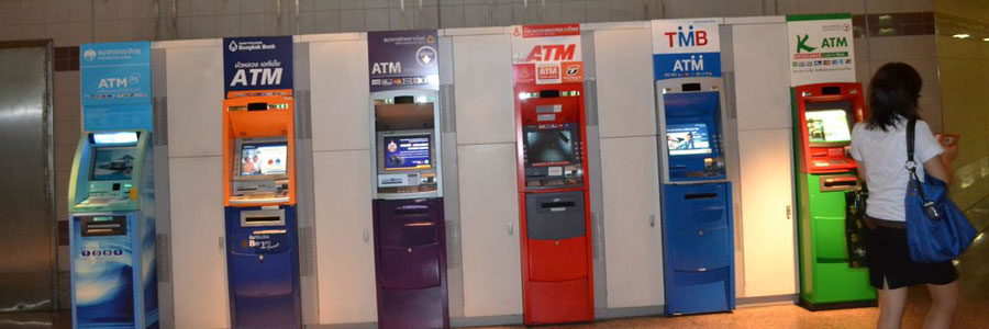
This situation happens quite often in businesses. Here is an example of ATM orgy in Thailand:

ATMsThailand

The Russians like it hard-core, here are 13 ATMs in Omsk. Each one with a separate servicing company, a separate filing schedule, and separate mechanical failures. You don’t need to think of efficiency when you can charge large credit card fees.

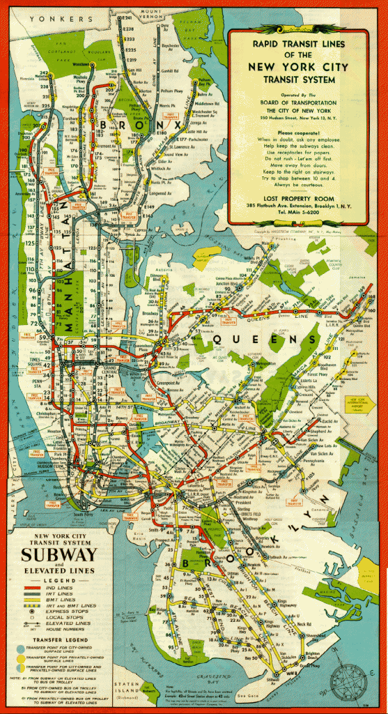
One would think that the United States, as an old capitalist country, would not suffer from the examples like this. Highly competitive markets should punish inefficient companies. But the most interesting example comes from just around the corner from Wall Street. Did you know that at the beginning of 20th century there were three independent subway companies in New York? They were called IRT, BMT and IND (click image for larger version):

system_1948

They not only directly competed for passengers on some routes, but also had incompatibile systems. BMT/IND trains couldn’t fit into an IRT tunnel, because they were wider and longer. IRT trains could fit into a BMT/IND tunnel, but since they were narrower, the distance from the train to the platform was unsafe. As with the POS and ATM examples, customers were charged fees when switching from one company to another. New York City realized that this situation wasn’t good and in June of 1940 bought BMT and IRT (IND was already owned by the city). They started the unification project which included closing more than five redundant lines, as well as overhaul of IRT trains, and introducing free transfer points. Here is the picture of IRT Second Avenue Line, being demolished shortly after the unification:

Second_Avenue_El_-_demolition

In this case market failed to reach the optimal point and the local government stepped in an attempt to make it better.

Don’t get me wrong, I believe that capitalism works better than communism (I lived in both). After all, I have two companies. But I also believe in the following advice:

Do what you do best and outsource the rest.

What bothers me with above examples is that companies start putting large efforts in activities that don’t add value to customers. Making trains incompatible doesn’t improve a daily commute. Having 34 POS machines makes process of charging slower. But both add a significant infrastructure cost.

As I was giving my credit card to the lady in the insurance office, I was shaking my head. In the end my money pays for craziness of this system, and I don’t like it. If you feel the same, share the article.


UPDATE: I have edited the last bit to clarify my opinion, as many people on Hacker News presumed I am advocating against capitalism. Again, I am not.

Demon core

At the start of its metal life, it was just the Third core, as it was the third in the family. Here is the entire family of plutonium cores, dressed up in fashionable magnesium casings:

First-three-Pu-cores

The oldest one is on the left, the Gadget core. It exploded at the Trinity test site in the first-ever atomic blast.

The younger brother is in the middle, the Fat Man core. It exploded over Nagasaki and killed 40,000-80,000 Japanese civilians.

Missing from these pictures is the Little Boy core, the black sheep in the family. A fat blob made of 64kg of uranium, it dwarfed smaller 6.2kg plutonium cores. But as black sheeps often do, it achieved the biggest fame. It exploded over Hiroshima.

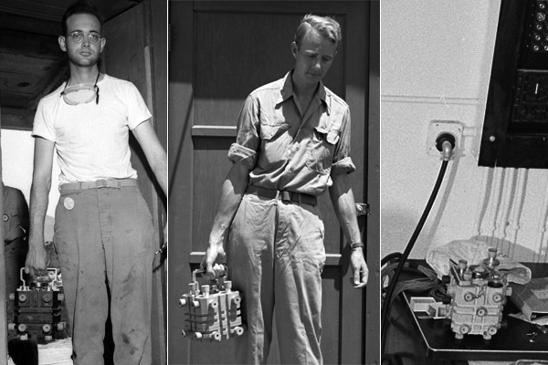
On the right is the youngest and the hero of our story. Actually, the photo only shows its magnesium casing; the third core was busy elsewhere. Japan surrendered in August 1945, and there were no plans for another atomic bombing. So it was used at the Los Alamos lab for criticality experiments:

Partially-reflected-plutonium-sphere

Its future seemed quite boring compared to its older brothers, but the Third core had its own plans. The first accident happened on August 21, 1945.

To understand what happened, we need to understand what a criticality experiment is. A critical mass is the smallest amount of fissile material needed for a sustained nuclear chain reaction. All plutonium cores are built dangerously close to that limit. The Third core was at 95% of its critical mass. So it was safe; you could use it for bowling if you wanted. But this is the trick: you can make it go critical by compressing it with high explosives, which are used in implosion-type nuclear bombs. However, blowing stuff up is not very practical in lab environments, as you need your core and your scientists to be undamaged for the next experiment. In Los Alamos, they used neutron reflectors to simulate the first nanoseconds before the explosion. Surround part of the core with tungsten carbide bricks, and they reflect neutrons back in. The same core is now 96% critical. Keep adding bricks around, like Legos, and you will reach 97% and 98% criticality. One more brick, and you will be at 99%. One percent away from an uncontrolled chain reaction. But this is a mechanical, simple procedure done by the smartest physicists in the country. What can go wrong?

That day in August, physicist Harry Daghlian was doing a criticality experiment. He was alone, with a security guy sitting at a nearby desk. He started adding bricks and measuring the resulting radiation. Understanding the thin border of criticality is crucial. The faster the criticality happens, the better yield a nuclear weapon has. He was quite close to the border when a funny thing happened. The tungsten carbide brick slipped from his sweaty hand and fell on the core. The room started glowing electric blue. While Harry was panickingly disassembling the pile of bricks, the security guy was asking himself, what the hell is happening? It lasted only a few seconds before the hot core was stripped naked, and the reaction stopped. All was silent. The two men reported to the hospital soon after. Harry Daghlian died 25 days later from acute radiation syndrome. Private Robert Hemmerly died 33 years later from leukemia.

This accident caused quite a stir in Los Alamos. Protocols were put in place to prevent future accidents. During lunch in the canteen, scientists would imagine mental experiments in which the core would go critical again. What is better–to quickly dismantle the core apparatus or to run away as fast as you can? If you leave slightly critical core, it would melt on the laboratory floor, and the reaction would stop. Of course, it takes more seconds to run out of the lab than to manually stop the reaction, but the calculation is not so simple. Radiation falls rapidly with the square of the distance, so with every step you run, the situation becomes much less dangerous. As real geeks, they calculated that prompt manual dismantling is the best choice because you just can’t run fast enough.

One of the physicists at those lunches was Louis Slotin. He was a young and cocky Canadian, often seen in his trademark blue jeans and cowboy boots. Not only he was unafraid, but fiddling with core also gave him a kick. In the new experiment, they ditched the bricks and replaced them with a neutron-reflecting beryllium half-sphere. If the core is completely covered, it goes critical. Therefore, mechanical spacers are put into place to ensure that the half-sphere only covers a certain percentage of it. Louis didn’t like spacers. He would perform criticality measurements holding a half-sphere top thumb hole with his left hand and holding it in position with a screwdriver in his right hand:

Tickling_the_Dragons_Tail

The scintillation counter on the side would show how far he could go. It was immediate and much faster than using spacers. Slotin called it “twisting the dragon’s tail” and performed it over a dozen times in front of spectating scientists. Enrico Fermi reportedly told Slotin and others that they would be “dead within a year” if they continued performing it.

On May 21, 1946, Louis was preparing to twist the dragon’s tail in a room with eight other people. Everything was going nicely. He slowly covered the core with a beryllium half-sphere until it was almost enclosed. The scintillation counter was happily ticking, and Louis was controlling the neutron-escaping gap with his screwdriver. Suddenly the tip of the screwdriver slipped, and everybody heard the metal cling of the half-sphere closing. The room filled with the blue light. Louis hastily kicked the half-sphere. The blue light was replaced with a deadly silence. They quickly left the room. After 10 minutes, they all decided to go back. With a piece of chalk, they marked where everybody stood at the moment of criticality. They were scientists, after all; this unplanned experiment would offer a rare opportunity to measure the effects of radiation poisoning on eight human subjects of varying age and varying distance from the radiation source. After diagramming, they reported to the sick bay. The first result followed soon, as Louis Slotin died nine days later. Others survived, but suffered from various radiation-related illnesses.

Nothing happened to the core, except for the name change. Older cores that killed more than 130,000 people far across the Pacific still had cute names like the Little Boy and the Fat Man. But with two dead colleagues, everybody at Los Alamos started calling this one the Demon core. Hands-on criticality experiments were halted and replaced with remote-control machines supervised from a quarter-mile distance.

Ultimately, it was decided to destroy the Demon core in a nuclear blast–for both the scientific value and publicity purposes. Marshall islands were chosen as the location of the first nuclear test where press and selected audience members were allowed. In the first of three planned explosions, the Demon core was to be dropped from a plane over a fleet of 95 decommissioned target ships. The zero point was a few hundred meters was above the USS Nevada, which had been painted bright red for targeting purposes:

640px-USS_Nevada_(BB-36)_Operation_Crossroads_Target_Ship

On July 1, 1946, as 114 journalists were waiting for an atomic explosion, the rough expectation was for nine ships (including two battleships and an aircraft carrier) to be sunk. Again, the Demon core had other plans. For reasons still unknown, the bomb missed the target by 650 meters. When the plutonium imploded and went critical, it was too far away to do any real damage. The test was a flop, and the press was disappointed. The New York Times reported that of all of the ships, “only two were sunk, one capsized, and eighteen damaged.”

The curse didn’t stop with the demise of the Demon core. The second test seemed more certain, as it was an underwater blast. The position was certain, and water carries more blast energy. On July 25th, a bomb named Baker was detonated 27 meters below the sea’s surface. Here is the photo (click for a large version); notice a black hole where the 27,000-ton battleship USS Arkansas was:

Baker-Nuclear-Test-Large

The blast was a success, but the events after were far from that. Because of the underwater nature of the test, all radioactive fission products remained in close proximity. The entire lagoon and target ships were radioactively contaminated. Ships were needed for a third test, so Navy fireboats were sent to do decontamination. They soon discovered that hosing down ships with water from the lagoon (also radioactive) didn’t help much. The Navy then sent 4900 sailors who tried scrubbing ships with water, soap, and lye:

Crossroads_Baker_Scrubdown

It didn’t work. The ships were still radioactive, and even worse, plutonium was everywhere. They caught a surgeonfish that had ingested enough plutonium to make its own x-ray on a film, without an x-ray apparatus. On August 10th, decontamination was canceled. The third test was never performed, and most of the target fleet was brought to open sea and sunk. So instead of being a demonstration of the US’s nuclear superiority, these two tests demonstrated that the US army couldn’t hit the target, estimate the fallout, or perform the cleanup.

This should be the end of the story of the misbehaved plutonium. But it is not, as it continues with the strangest twist.

That same year, in faraway France, two men were competing to push the boundaries of female fashion. After WW2, the feeling of liberation was in the air, for both sexual freedom and for a new, emancipated role of females in society. They both came to a similar idea–a two-piece swimsuit that covers only the minimum. Jacques Heim launched his swimsuit in June 1946, a few weeks before the Demon core exploded. Appropriately for the spirit of the times, he called it Atome and marketed as “the world’s smallest bathing suit.” This would not be for long because a few weeks later, Louis Réard, another Frenchman, decided to go even further. He concluded that there is no place for the belly button taboo in the “atomic age.” On July 5th, 1946 he unveiled his design that showed the navel for the first time. It was few days after the US nuclear test, and Réard got an idea. On July 18th he registered the name Bikini, as that was the name of atoll where the test took place. The rest is history; both the swimsuit and the name caught on, to the point that “bikini” became a generic name for a female swimsuit. Common assumption that the name “bikini” was given because of a historical or associative connection to the tropical islands, is not true. People on Bikini Atoll didn’t wear bikinis. And French had plenty of their own tropical islands.

So every time you see a bikini, remember that its name comes from a series of unfortunate events that include one plutonium sphere, one sweaty hand, one slipped screwdriver, and a whole bunch of ghost ships that just wouldn’t sink.


Links

Zero

In case you missed it, last Thursday was an important date for the history of computing. To understand why, we need to look way back. What was the most famous supercomputer?

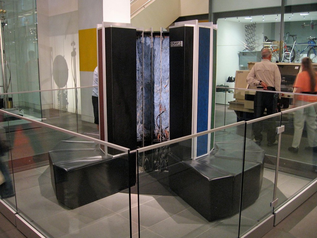
Favorite of many lists is Cray-1, freon-cooled, C-shaped monster from 1975:

London_Science_Museum_by_Marcin_Wichary_-_Cray-1_(2289290787)

Brutally powerful for its time, it earned Seymour Cray a title “father of supercomputers”. First machine was so wanted that it caused a bidding war between Lawrence Livermore National Laboratory and Los Alamos National Laboratory. This wicked supercomputer had vector processors capable of 160 MFLOPS connected to 8MB of memory.

Fast forward to the last week. Raspberry Pi Foundation announced model Zero, a shitty hobbyist computer size of a kiwi. It’s single core CPU barely makes 40 MFLOPS. But wait, it also has VideoCore IV GPU that has 24 GFLOPS peak performance! And MPEG-4 decoder/encoder. And 512 MB of memory. For all practical purposes, it makes Cray-1 bleed it’s own freon.

But here is the historic twist.

Raspberry Pi Zero was the first computer ever to be given for free on the cover of a magazine. In this case, MagPi issue 40, that completely sold out on Thursday:

40_cover_physical_small

So it took 40 years from a supercomputer worth $7.9 million ($31 million in today’s money) to a similar computer being given away for free, as a marketing stunt.

Makes you wonder what will happen in the next 40 years?


Guru under a banyan tree

People under a banyan treeWe first heard of a guru in the jungle while lying on Arambol Beach. Supposedly, in the nearby jungle there was a banyan tree. Below the tree lived a hermit who had said goodbye to the modern world many years ago. I was skeptical of the whole story, told by a guy with a never-ending beard. And we didn’t came to India to seek wisdom; we came to have fun. But still, my friend Marko and I decided to check it out the next day.

As tree roots started replacing the beach sand, we put our shoes on. “Jungle” was not as impenetrable as the local name would suggest to European laymen like us: the trail was visible and easily walkable. And full of people.

“Just walk 20 minutes straight,” said the couple we asked about the banyan tree.

The man we asked 15 minutes later was more specific.

“When you hit a small stream, just cross it. Uphill you will see a large tree. You can’t miss it.”

He was right, Broadway Street was easier to get lost on.

We crossed the stream and arrived at a tree where four white people were sitting in a circle on a large padded area in the shade. We asked to join them, and they quietly agreed. Everybody was sitting in the lotus position, so I copied them. One had a guitar. Slowly, we started talking and connecting bits of the story. The tall, super-skinny guy was the man who permanently lived under the tree. He was Dutch, and he arrived seven years ago. He had a very primitive shelter in the back. There was a small fireplace. Metal mugs and pans were hanging from the tree, together with sacks of rice and bananas. But it was not only dietary products. One guy slowly rolled a joint. It started going around the circle; we didn’t mind when it came to us. It was strong, as you would expect from weed grown in an Indian rainforest. One by one, depending on personal tolerance, we abandoned the lotus position and lay down on the padded earth. I watched the sky swinging between the branches. It was great.

The Dutch guy seemed the least affected. He kept messing with his bags. But he was far from normal. As new people approached the stream, he stood up.

“Jump over the water. Don’t put your dirty feet in!” he shouted. “I drink the water from that stream, goddammit!”

Newcomers didn’t reply, although their eyes showed surprise. Could you contaminate a running stream just by walking through? If you want your water sterile, why do you live in the jungle?

Awkwardness continued as everyone sat down. During conversation, the Dutch guy raised his voice a few times to impose authority. He repeated that we needed to respect his place, not abuse his generosity. He seemed aggressive.

I nodded to my friend, and he nodded back:  it was time to leave. We said goodbye and started walking back.

“What an enlightened prick!” I commented.

“Yes,” my friend agreed. “I guess that’s what happens when you live in a jungle for seven years.”

But we were in for an even bigger surprise.

“You know that’s not the real guy?” said a woman we met on our way back. Her friend nodded.

“What do you mean?” We were surprised.

“That guy is a fake. The real Indian guy is under another tree.”

She showed us the path to the other tree; it was 10 minutes’ walking.

Tree number two looked less impressive. It was smaller and located downhill, and with a smaller padded area. But the baba sitting there was the real deal: dark Indian with an even darker turban, snow-white beard, and bare chest. We already knew the procedure. We quietly greeted him, he nodded in approval and a gestured to a place where we could sit down. Another tourist was explaining to baba that he was famous—a passage in a guidebook mentioned him as the local attraction. Baba gently smiled. We asked many questions, but he was not surprised; he was greeting many people every day. The tree was full of inscriptions from passing tourists.

He started living in the jungle 27 years ago, alone, under the large banyan tree that we visited. Seven years ago, a Dutch guy came and asked if he could join him. Although he was strange and sometimes abrupt, it worked for a few years. But two years ago the situation escalated, and one night, in a moment of insanity, the Dutch guy tried to kill him. Baba was unharmed but worried. What could he do? He didn’t want to call the police or use any kind of forceful action; that was against his beliefs. He decided that, after many years, it was time to find another tree. A week later, he found this tree—less prominent but still nice. That is where he had lived for two years, greeting visitors and leading a peaceful life. Indeed, his smile was contagious. We were impressed: he was glowing with positivity. How could the Dutch guy be mean to him?

At one point, my friend asked if he could take a photo. Baba said no, we could get unlimited words of wisdom but not one tourist photo. My friend took the camera down. But I knew what he would do. While the camera was in his lap, he discreetly pressed the trigger while Baba was looking away.

I know what you’re thinking. We broke the promise given to the old, welcoming man. Bloody tourists. But there is a workaround. On a philosophical level, baba was not against photo-taking per se. After all, photons reflecting off his body and entering the lens of the camera didn’t do him any harm. He was against other people looking at his photo, as a matter of privacy. We can solve that. As a moral person, you are going to respect baba‘s wish. And you are not going to visit this link with a photo of baba sitting under a tree. No eyes looking, no problem.

We left baba with heads full of questions. What was true and what was a lie? Is the whole story about 27 years in a jungle a way to get sympathy from tourists? Maybe he sleeps in a proper hut and just comes to the tree in the early morning? Regardless of that, we learned one important thing—how to become a guru in a jungle:

  1. Get a distinct look. Nobody is going to believe you are in touch with divine wisdom if you look like the average Rahul. Grow body hair extremely long or shave it completely. Show that you don’t need worldly things such as underpants. But, since there are millions of babas doing the same thing, be even more extreme. A common idea is to demonstrate the strength of your penis by wrapping it around a stick or a heavy block.
  2. Find a place of solitude. A tree, a cave, a giant rock. But remember, it still needs to be accessible to people, otherwise nobody is going to visit.
  3. Just sit there. Somebody is going to see you and start spreading rumors. A divine man? A guru? A healer? You don’t advertise in any way, so the only way to learn about you is to visit you.
  4. Become a good psychologist. Every question a visitor asks you is a hint about what they came to find. In the beginning, you are probably going to have difficulties answering some of them. But every visitor is a practice session. You see which answers make them happy and which don’t. After you accept visitors day after day and month after month, you will have a wise answer for any question.
  5. Make a living out of it. If you are good at satisfying visitors’ needs, they are going to spread the word. You will become a local guru. New visitors will come in flocks, and they are going to bring presents. Flowers, food, sometimes even money. Now you have a work-from-home office and an extremely busy social life. Complete strangers visit you from far away and share intimate details of their lives.

But it’s not so easy to become successful.

If you give nonsensical advice or make your visitors uncomfortable, the word is going to be that you are just a crazy man. Some may still visit you, but they will not feel obliged to bring you presents. You will be labeled as a fake guru. Tired and hungry, one day you will pack all your earthly possessions in a small sack and return to your village.

We experienced two different examples. I could imagine myself bringing a bag of rice back to baba in the jungle; he was interesting and positive. The Dutch guy was not, the only reason to go back to that place would be to smoke pot.

It seems the history of organized beliefs was often like that. The Bible warns about false prophets in 70 different places. But I never learned about minor, fake ones. How many other prophets were there for every Jesus, Buddha, or Muhammad? Buy a ticket to India and experience firsthand how it worked for millennia.

Or be even bolder: become a prophet. My friend and I joked while leaving the forest; we just needed a nice tree, long beards, and we could offer a third option to visitors of the Arambol jungle. It would be an interesting endeavor, cheaper and simpler than the Kumaré experiment.

My beard is currently only three centimeters long. But one day, one fine day…