After many months in the making, today we are happy to announce v1 of PXT Protocol (MIT license). This is a big thing for our small team, as we aim to provide an alternative to HTTP/HTML.
Before I dive into technical details of our unconventional approach, I must explain the rationale. Bear with me.
Web bloat
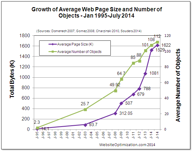
Today’s web is in a deep obesity crisis. Bloggers like Maciej, Ronan, and Tammy have been writing about it, and this chart summarizes it all:

Notice the exponential growth. As of July 2016, the average web page is 2468 kB in size and requires 143 requests.
But computers and bandwidth are also getting exponentially faster, so what’s the problem?
Web bloat creates four “S” problems:
- Size. A few years ago, a 200MB/month phone data plan was enough. Today my 2GB plan disappears faster than Vaporeon pokemon.
- Speed. The web can be 10x faster. Especially over mobile networks, as phone screens need to show fewer elements.
- Security. The modern browser is actually an OS that needs to support multiple versions of HTML, CSS, HTML, SVG, 8+ image formats, 9+ video formats, 8+ audio formats, and often adds a crappy plugin system just for fun. That means the browser you are looking at right now has more holes than a pasta strainer. And some of them would allow me root access to your system right now. I just need to offer enough bitcoins on a marketplace for zero-day exploits.
- Support. All that bloat needs to be implemented and maintained by people. Front-end has become so complicated that now designers who can also code are called unicorns.
One can say “Problems, schmoblems! We had problems like this in the past, and we lived with them. The average web page will continue to grow.”
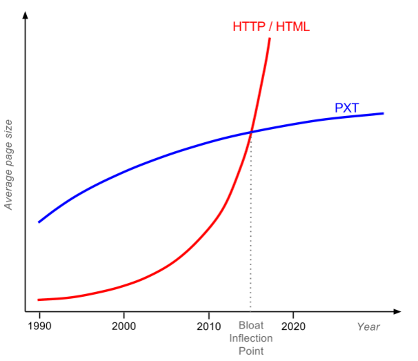
No, it will not. Because there is a magic limit—let’s call it the bloat inflection point:

For pages that are small and non-bloated (most pre-2010 pages), PXT only solves security and support problems. But today’s average web page will also gain big size and speed improvements. The Internet passed the bloat inflection point early this year, and nobody noticed.
PXT solves these problems by focusing on the core: the presentation. The majority of bloat pushed to client browsers has only one purpose—to render the page. Even JavaScript is mostly used to manipulate DOM. Images alone comprise 62% of a page’s total weight. Often images are not resized or optimized.
Responsive webs just make it worse. The fashion now is to have one sentence per viewport and then a gigantic background image behind it.
Developers have gotten lazier and lazier over the years. At the same time, compression technologies got better, both lossless and lossy. So we got an idea…
What if a client-specific page was rendered on a server, and then
streamed to a “dumb browser” using the most efficient compression?
Like all great ideas, this sounds quite dumb. I mean, sending text as compressed images?! But I did a quick test…
Demo time
Let me show you a simple non-PXT demo; you can follow it without installing any software.
The procedure is simple:
- Find a typical bloated web page.
- Measure total page size and # of requests. I used the Pingdom speed test.
- Take a full page screenshot. I used the Full page screen capture chrome extension.
- Put into table and calculate the bloat score.
Bloat score (BS for short) is defined as:
BS = TotalPageSize / ImageSize
We can derive a nice rule from the bloat score:
You know your web is crap if the full image representation of the
page is smaller than the actual page (BS>1).
I expected some screenshots to beat full page loads, but I was wrong. Screenshots won in every case. See for yourself in the table below: Image columns contain links to comparison images.
| Full PNG (1366 x ?) | Full TinyPNG (1366 x ?) | Viewport TinyPNG (1366 x 768) | ||||||
| Page | Size (kB) | # of req. | Image (kB) | BS | Image (kB) | BS | Image (kB) | BS |
| TechTimes Google Tags Slow Websites | 22,000 | 494 | 2,368 | 9.3 | 527 | 41.8 | 139 | 158.3 |
| Vice Bootnet to Destroy Spotify | 5,000 | 174 | 2,346 | 2.1 | 584 | 8.6 | 228 | 22.0 |
| RTWeekly Future of Data Computing | 3,400 | 118 | 2,009 | 1.7 | 581 | 5.9 | 249 | 13.6 |
| Betahaus Creative Problem Solving | 5,100 | 55 | 3,670 | 1.4 | 871 | 5.9 | 393 | 13.0 |
| AVERAGE: | 3.6 | 15.5 | 51.7 | |||||
Which column should you look at? That is highly debatable:
- Full PNG column represents entire page as lossless PNG. Pixel perfect, but a bit unfair because PNG screenshots are lossless and therefore have worse compression if original page contained lossy JPEGs.
- Full TinyPNG column represents entire page as color indexed PNG.
- Viewport TinyPNG column uses color indexed PNG of a typical viewport. Idea is that since 77% of users close the page without scrolling down, for them it doesn’t make sense to load the entire page.
So, depending on how aggressive you want to be with buffer size and compression, data saving for above pages varies from 3.6x to 51.7x!
But, to be honest, I cheated a bit. Images are static—the interaction part is missing. And you’ll notice in the table that I hand-picked bloated websites, they are all above average. What happens with normal websites?
For the simple interaction, let’s use a technology that’s been around since 1997. And works in IE! People drafting HTML 3.2 got annoyed with designers requesting a “designer” look and consistent display over browsers. Rounded rectangles and stuff. In a moment of despair they said f**k you, we’ll give you everything. Create a UI out of a image and then make arbitrary vector shapes over clickable areas. And so client image maps were born.
For an example of “normal” page, should we use a really popular page or a really optimized page? How about both—let’s use the most popular web page created by the smartest computer scientists: the Google SERP. SERPs are loaded over 3.5 billion times per day and they are perfect for optimization. SERPs have no images, just a logo and text. Unlike other pages, you know user behavior exactly: 76% of users click on the first five links. Fewer than 9% of users click on the next page or perform another search.
I measured SERP for “web bloat”, and found that its size is 389.4 kB and it uses 13 requests.
I took a full page screenshot, and created a simple HTML page with an image map. The total is 106.7 kB and 2 requests. Therefore, Google SERPs have BloatScore of 3.6.
People always bash media sites for being bloated and flooded with ads. But Google SERPs increased in size from 10 kB in 1998 to 389 kB today. And content is pretty much the same, 10 links. Google.com is fast to load not because of optimization; it is fast because today you have a fast connection.
The image map for the SERP demo above has a fixed width and height, which is one of the reasons we need PXT. The first PXT request sends device viewport details, so the server knows which image to render.
But before we get into PXT, we need to ask ourselves a question…
How did this happen?
Since the first computers were connected, there was a fight. Between the “thin” tribe and the “fat” tribe.

The thin tribe wanted to render everything on the source server and make the destination server a “dumb” terminal. Quick, simple, and zero dependency. But the fat tribe said no, it’s stupid to transfer every graphics element. Let’s make a “smart” client that executes rendering or part of the business logic on the destination server. Then you don’t need to transfer every graphics element, just the minimum data. The fat tribe always advertised three benefits of smart clients: smaller bandwidth, less latency, and that the client can render arbitrary stuff.
But, in the early days of computing, “graphics” was just plain text. Data was pretty much the same as its graphic representation, and people could live with a short latency after they pressed enter at a command line. The thin tribe won and the text terminal conquered the world. The peak of this era was the IBM mainframe, a server that can simultaneously serve thousands of clients thanks to its I/O processors. The fat tribe retreated, shaking its collective fist, saying, “Just you wait—one day graphics will come, and we’ll be back!”
They waited until the 80s. Graphics terminals become popular, but they were sluggish. Sending every line, color, or icon over the wire sucked up the bandwidth. When dragging and rearranging elements with the mouse, you could see the latency. Unlike simple text flow, graphics brought myriad screen resolutions, color depths, and DPI.
“We told you so!” said the fat tribe, and started creating smart client-server solutions. Client-servers and PCs were all the rage in the 80s. But even bigger things were on the horizon.
In 1989, a guy named Tim was thinking about how to create world wide web of information. He decided not to join the tribe but to go the middle route. His invention, HTML, would transfer only the semantic information, not the representation. You could override how fonts or colors looked in your client, to the joy of fat tribe. But for all relevant computing you would do a round trip to the server, to the delight of the thin tribe. Scrolling, resizing, and text selection were instantaneous: there was only a wait when you decided to go to the next page. Tim’s invention took the world by the storm. It was exactly the “graphics terminal” that nobody wished for but everybody needed. It was open and people started creating clients and adding more features.
The first candy was inline images. They required more bandwidth, but the designers promised to be careful and always embed the optimized thumbnail in the page. They also didn’t like the free floating text, so they started using tables to make fixed layouts.
Programmers wanted to add code on the client for validation, animation, or just for reducing round trips. First they got Java applets, then JavaScript, then Flash.
Publishers wanted audio and video, and then they wanted ads.
Soon the web became a true fat client, and everybody liked it.

The thin tribe was acting like a crybaby: “You can’t have so many dependencies—the latest Java, latest Flash, latest Real media encoder, different styles for different browsers, it’s insane!” They went on to develop Remote desktop, Citrix XenDesktop, VNC, and other uncool technologies used by guys in grey suits. But they knew that adding crap to the client couldn’t last forever. And there is a fundamental problem with HTML…
HTML was designed for academics, not the average Joe
Look at the homepages of Tim Berners-Lee, Bjarne Stroustrup, and Donald Knuth. All three together have 235 kB, less than one Google SERP. Images are optimized, most of the content is above the fold, and their pages were “responsive” two decades before responsive design became a thing. But they are all ugly. If the father of the WWW, the father of C++, and the father of computer algorithms were in an evening web development class, they would all get an F and be asked to do their homepages again.
The average Joe prefers form over content and is too lazy to write optimized code. And the average Joe includes me. A few months ago homepage of my previous startup become slightly slower. I opened the source HTML and found out that nine customer reference logos were embedded in full resolution, like this 150 kB monster. I asked a developer to optimize pages using css sprites. He complied with that, but told me he would leave 13 other requests for web chat unchanged, because they are async and provided by a third party (Olark). To be honest, I would behave the same if I were a web developer. Implementing customer features will bring us more money than implementing CSS sprites. And no web developer ever got a promotion because he spend the whole night tweaking JPEG compression from 15% to 24%. To summarize:
You can’t blame web developers for making a completely rational decision.
Web developers always get the blame for web bloat. But if a 2468 kB page weight is the average, not an exception, then it is a failure of the technology, not all the people who are using it.
At one point, Google realized there was an issue with the web. Their solution: SPDY (now part of HTTP/2) and Brotli. The idea is that, although the web is crap, we will create the technology to fix the crap on the fly. Brotli is particularly interesting, as it uses a predefined 120 kB dictionary containing the most common words in English, Chinese, Arabic, as well as common phrases in HTML and JavaScript! But, there is only so much that lipstick can do for a pig. Even the best web compressor can’t figure out whether all that JS and CS is actually going to be used, or replace images with thumbnails or improve the JPEG compression ratio because the user would never notice the difference. The best compressors always start from the target. MP3 achieved a 10:1 compression ratio by starting with the human ear. A web compressor should start with the human eye. Lossless compression of some 260 kB JS library doesn’t help much.
The thin tribe realized that with a good compressor and good bandwidth the game changes. OnLive Game Service was launched in 2010, allowing you to stream games from the cloud. The next year, Gaikai launched their service for cloud gaming. They were not competitors for long: Sony purchased Gaikai in 2012, and all OnLive patents in 2015. They used the technology to create PlayStation Now. Today I can play more than 400 live games on Samsung Smart TV, at 30 frames per second. But I still need to wait 8.3 second to fully load the CNN homepage. Who is crazy here?
Remember main arguments of the fat tribe: smaller bandwidth, less latency, and that the client can render arbitrary stuff. Seems that with websites of 2016, thin tribe can do all of that equally good or better.
I want my web to be as snappy as PlayStation Now. That is why we need…
PXT protocol
Which is short for PiXel Transfer protocol. Let’s see how the full stack works, all the way from a designer to an end user.
- Design. Designers create designs the same as they do now, in Photoshop. After the design is approved, they make it “responsive” by creating narrow, medium, and wide version of the design (same as now). In addition, they need to use a plugin to mark some elements in PSD as clickable (navigation, buttons) or dynamic (changeable by the server).
- Front-end coding. No such thing. No two-week delay until design is implemented in code.
- Back-end coding. Similar to now, you can use any language, but there’s a bit more work as you need to modify the display on the server. We provide libraries to change PSD elements marked with dynamic.
- Deployment. On your Linux server or, better, PXT cloud. Why the cloud? An old terminal trick is always to move the server closer to the user. As we grow, we plan to have servers in every major city. One of the major reasons Playstation Now works is because they have data centers distributed all over North America.
- Browser. Currently users need to install a browser plugin. But because of that, you can mix PXT and HTML pages.
Specifically, this is how browsing happens:
- Browser requests an URL of a PXT page, sends viewport size, DPI, and color depth.
- Server checks the cache or renders a new image, breaks into text and image zones, and uses lossless or lossy compression appropriately.
- Browser receives a single stream with different zones, assembles them, and caches them for the future.
- When user clicks, zooms, or scrolls out of available zones, request for new image(s) is sent to the server.
Notice the heavy use of caching. If you have a page footer or logo, they are going to be transferred only once, as on the subsequent pages the server is going to send only the zone ID.
I know what you are thinking. This all looks nice for presentation, but the web is more than a display. Although it was loved by designers, one of the biggest flaws of Flash was that Flash indexing by web crawlers never worked well. So, what about the SEO?
The future of the search is optical recognition and deep learning. Google Drive has done OCR on PDF and images since 2010. Google Photos recognizes people and things, for example any bicycle in my personal photos. And YouTube does voice recognition over videos, so people can easily skip boring parts of my video. With the web becoming much more than text, why rely on text metadata at all?
With that final point, I invite you to check the PXT project page at GitHub.
UPDATE: Check the discussion on Reddit.
Pingback: Free online 'Web Bloat Scores' encourage overweight pages to slim down – TECH BLOGS